


Introduction
Learning CSS can be overwhelming at times with many properties to remember. This tutorial will help you break down how CSS art is made.
Getting Started
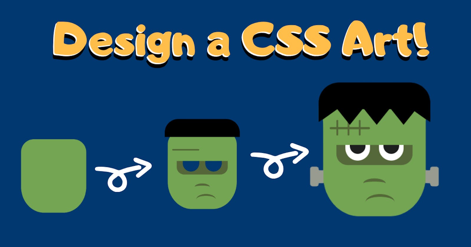
Visualizing Frankenstein
We need to visualize how exactly we want the CSS art to be. A basic outline of the art will make it easier to add details accordingly.

A fast and effective way to make CSS project is by using Codepen , an online editor which let's us code in HTML, CSS, and Javascript without linking the files.
Breaking it Down!
A pure CSS Art consist of several divs in HTML.
The project can be simplified into these components:
HTML div for each shape
CSS classes assigned to each div
Styling each class of CSS
A container div containing the entire face
The Container
We will place the entire CSS image in a class called Container This will help us move the face accordingly.
<html>
         <body>
           <div class="container">
           </div>
        </body>
    </html>
The HTML
Before we get started,we need to know how divs are positioned. For example, a div2 placed below div1 will overlap div1. To understand this we can think of the divs in form of layers. As given in the image, the rectangular face will be first layer. Let's name it Layer 0. The next part, Layer 1, will consist of the eyes, nose, mouth, and hair. Layer 2will consist of more details like the eyeball, triangular shape of hair, etc. Here Layer 2 will be placed over Layer 1.
Lets create the divs!
<html>
<body>
  <div class="container">
      <div class="face">
        <div class="eyes">
          <div class="eye-left">
            <div class="eye-ball"></div>
          </div>
          <div class="eye-right">
            <div class="eye-ball"></div>
          </div>
          <div class="nose"></div>
          <div class="mouth"></div>
        </div>
        <div class="scratch">
          <div class="a left"></div>
          <div class="a center"></div>
          <div class="a right"></div>
        </div>
        <div class="hair">
          <div class="flick1"></div>
          <div class="flick2"></div>
          <div class="flick3"></div>
          <div class="flick4"></div>
          <div class="flick5"></div>
        </div>
        <div class="nail lft">
          <div class="nail1"></div>
        </div>
        <div class="nail rgt">
          <div class="nail2"></div>
        </div>
      </div>
  </div>
</body>

</html>
The CSS
Here comes the fun part! Let's design layer by layer. Layer 0
We will style body, container and face classes in this layer.
body {
  background: #44626f;
  position: relative;
  display: flex;
  justify-content: center;
  align-items: center;
}
.container {
  text-align: center;
}
.face {
  width: 230px;
  height: 260px;
  background: #73a552;
  position: absolute;
  top: 25vh;
  left: 35vw;
  border-top-left-radius: 45px;
  border-top-right-radius: 45px;
  border-bottom-left-radius: 35%;
  border-bottom-right-radius: 35%;
  z-index: 1000;
}
Here in body, we set background color to #44626f, display to flex so that we can set justify-content to center.
The values of width , height , position and border-radius can be determined by experimenting. With practice, you will be able to figure it out.

Layer 1
We have eyes, eye-left, eye-right, scar, mouth, nose, and hair in this layer. Let's also style these with CSS!
.eyes {
  width: 170px;
  height: 45px;
  background: #556839;
  position: absolute;
  top: 100px;
  left: 30px;
  border-bottom-left-radius: 25px;
  border-bottom-right-radius: 25px;
}
.eye-left {
  width: 55px;
  height: 35px;
  background: white;
  left: 20px;
  position: absolute;
  border-bottom-left-radius: 80px;
  border-bottom-right-radius: 80px;
}
.eye-right {
  width: 55px;
  height: 35px;
  background: white;
  left: 95px;
  position: absolute;
  border-bottom-left-radius: 100px;
  border-bottom-right-radius: 100px;
}
.eye-brow {
  width: 35px;
  height: 20px;
  background: #1e201f;
  left: 10px;
  position: absolute;
  border-bottom-left-radius: 100px;
  border-bottom-right-radius: 100px;
}
.nose {
  width: 50px;
  height: 15px;
  border-top: 7px solid #556839;
  position: absolute;
  border-radius: 50%;
  top: 75px;
  left: 60px;
}
.mouth {
  width: 65px;
  height: 30px;
  position: absolute;

  border-top: solid 6px #546837;
  border-radius: 50%;
  top: 110px;
  left: 65px;
}
.scratch {
  width: 90px;
  height: 5px;
  background: #536936;
  position: absolute;
  top: 60px;
  left: 15px;
  border-radius: 25px;
}
.hair {
  width: 250px;
  height: 60px;
  background: black;
  position: absolute;
  left: -10px;
  top: -40px;
  border-top-left-radius: 45px;
  border-top-right-radius: 45px;
}

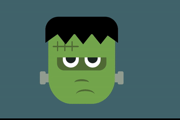
Our Frankenstein looks a bit scary at this point, Layer 2 is where the magic happens!
Layer 2
Layer 2 is the most important layer as all the detailed work is done here. Let's add the final details.
.eye-ball {
  width: 35px;
  height: 20px;
  background: #1e201f;
  left: 10px;
  position: absolute;
  border-bottom-left-radius: 100px;
  border-bottom-right-radius: 100px;
}
.a {
  height: 35px;
  width: 4px;
  border-radius: 25px;
  position: absolute;
  background: #546737;
  top: -16px;
}
.left {
  left: 15px;
}
.center {
  left: 40px;
}
.right {
  left: 65px;
}
.flick1 {
  clip-path: polygon(0 0, 0% 100%, 100% 0);
  width: 70px;
  height: 50px;
  background: black;
  position: absolute;
  top: 40px;
  left: 0px;
}
.flick2 {
  clip-path: polygon(0 0, 50% 100%, 100% 0);
  width: 80px;
  height: 50px;
  background: black;
  position: absolute;
  top: 45px;
  left: 30px;
  border-radius: 15px;
}
.flick3 {
  clip-path: polygon(0 0, 50% 100%, 100% 0);
  width: 80px;
  height: 50px;
  background: black;
  position: absolute;
  top: 45px;
  left: 90px;
}
.flick4 {
  clip-path: polygon(0 0, 50% 100%, 100% 0);
  width: 80px;
  height: 50px;
  background: black;
  position: absolute;
  top: 45px;
  left: 150px;
}
.flick5 {
  clip-path: polygon(0 0, 100% 100%, 100% 0);
  width: 70px;
  height: 50px;
  background: black;
  position: absolute;
  top: 40px;
  left: 180px;
}
.nail {
  height: 30px;
  width: 30px;
  background: #979b90;
  position: absolute;
  z-index: 999;
}
.lft {
  top: 156px;
  left: -29px;
}
.rgt {
  left: 229px;
  top: 156px;
}
.nail1 {
  width: 20px;
  height: 45px;
  background: #979b90;
  top: -8px;
  position: absolute;
  border-radius: 5px;
}
.nail2 {
  width: 20px;
  height: 45px;
  background: #979b90;
  top: -8px;
  position: absolute;
  border-radius: 5px;
  left: 10px;
}
The triangular shape of hair (flick) can be made using Clippy .
Clippy is a handy tool to make shapes as well as custom shapes too. Frankenstein is ready!

Let's Animate!
We will make the eye-balls move. This can be achieved using animation property and @keyframes.
.eye-ball {
  width: 35px;
  height: 20px;
  background: #1e201f;
  left: 10px;
  position: absolute;
  border-bottom-left-radius: 100px;
  border-bottom-right-radius: 100px;
  animation: roll 5s 3;
  animation-delay: 10s;
}
@keyframes roll {
  0% {
    left: 10px;
  }
  10% {
    left: 10px;
  }
  30% {
    left: 0px;
  }
  55% {
    left: 20px;
  }
  70% {
    left: 0px;
  }
  100% {
    left: 10px;
  }
}
That's it! Share what you have made, or try your own work of art!